“Designing a mobile app for a cultural institution sounds simple, until you step inside the complexity of a gallery experience…”
This project focused on three core elements:
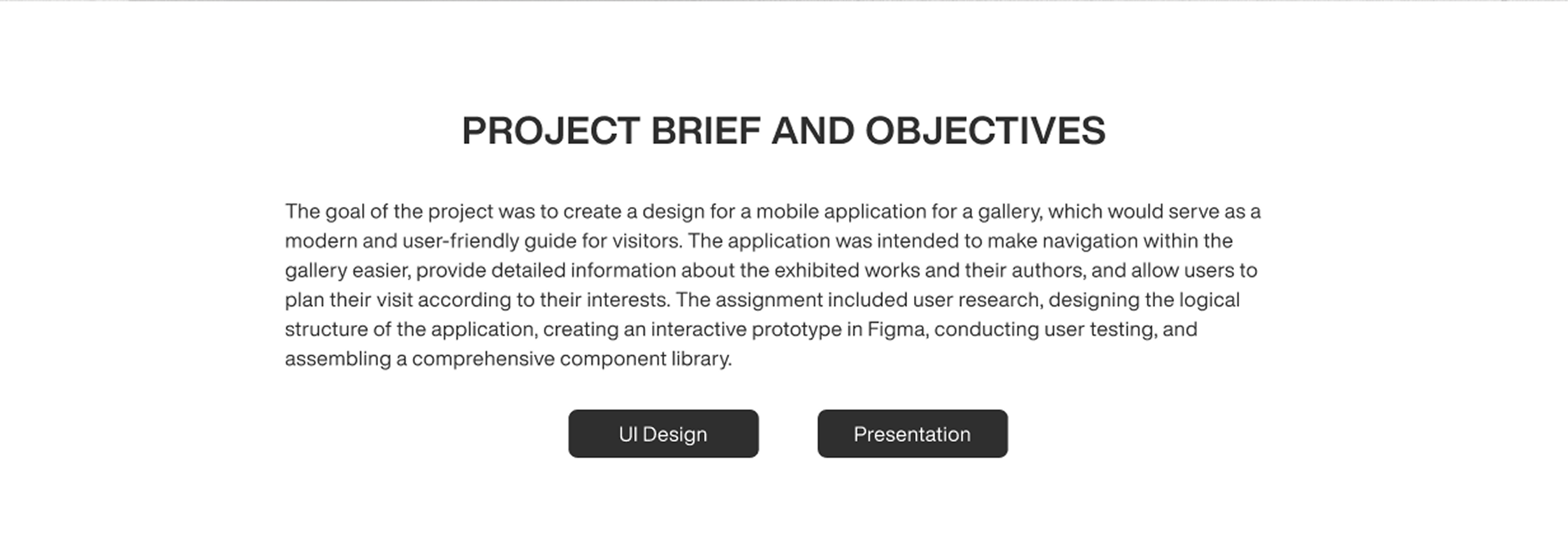
I worked end-to-end handling research, UX / UI, prototyping, and testing turning a school brief into a fully realized product concept.
“The goal wasn’t to fix a broken system, but to introduce a new, more accessible layer to the gallery experience.”
Visiting a gallery can be inspiring, but often limited by what’s physically available in the space.
Information is tied to walls, distance, and crowd density.
Access depends on where you stand, how much time you have, and how comfortable the format is.
My concept focused on these opportunities:
Access to information
View details about artworks and artists without relying on physical labels
Ease of use
Simple ticket purchase and a clear overview of current exhibitions
Extended experience
Scan artworks, explore artistic movements, and revisit content anytime
The idea was to create a mobile app that complements the physical visit making it more flexible, inclusive, and self-directed.
Before designing anything, I needed to understand how people actually behave in galleries, not how we think they do.
I approached the problems:
“Users don’t want more information, they want the right information at the right moment.”
This insight shifted the direction. It wasn’t about adding features. It was about making things more accessible.
“The design process moved from structure to interaction.”
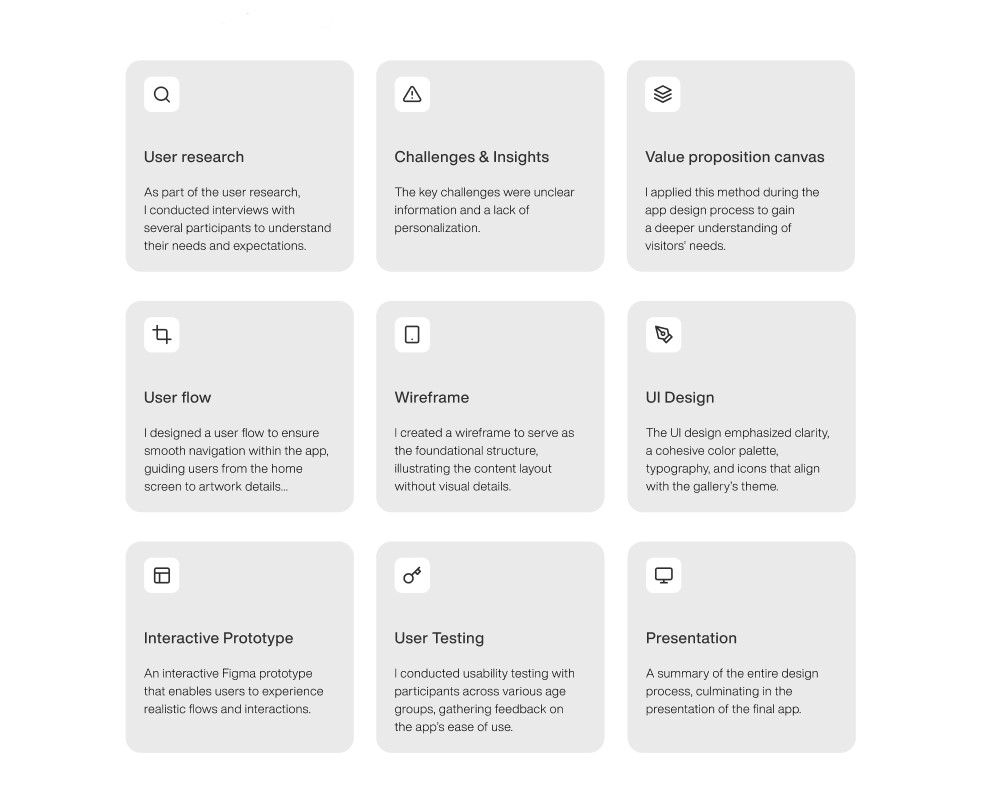
First came clarity:
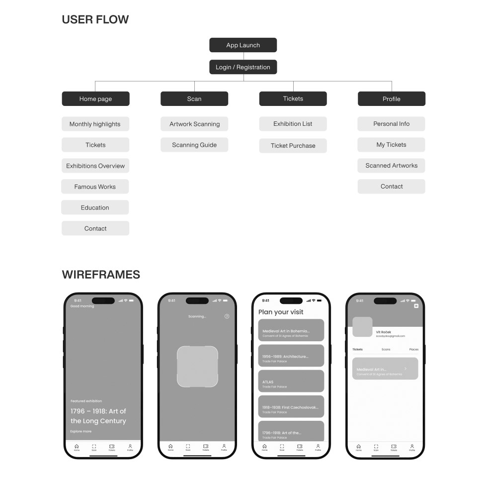
Then came interaction:
Three priorities guided every decision:
Some features clearly delivered value:
Other areas remained unfinished:
| Area | Status | Insight |
|---|---|---|
| Personalization | Partial | Saving works isn’t enough without deeper recommendations |
| Social features | Not solved | Sharing could extend the experience beyond the visit |
| Visitor analytics | Not solved | Data could improve both UX and exhibitions |
The result was a strong foundation—but not a complete ecosystem.


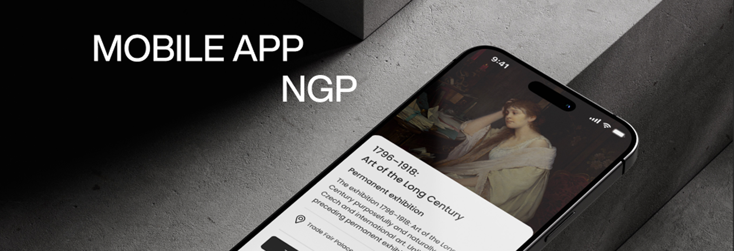
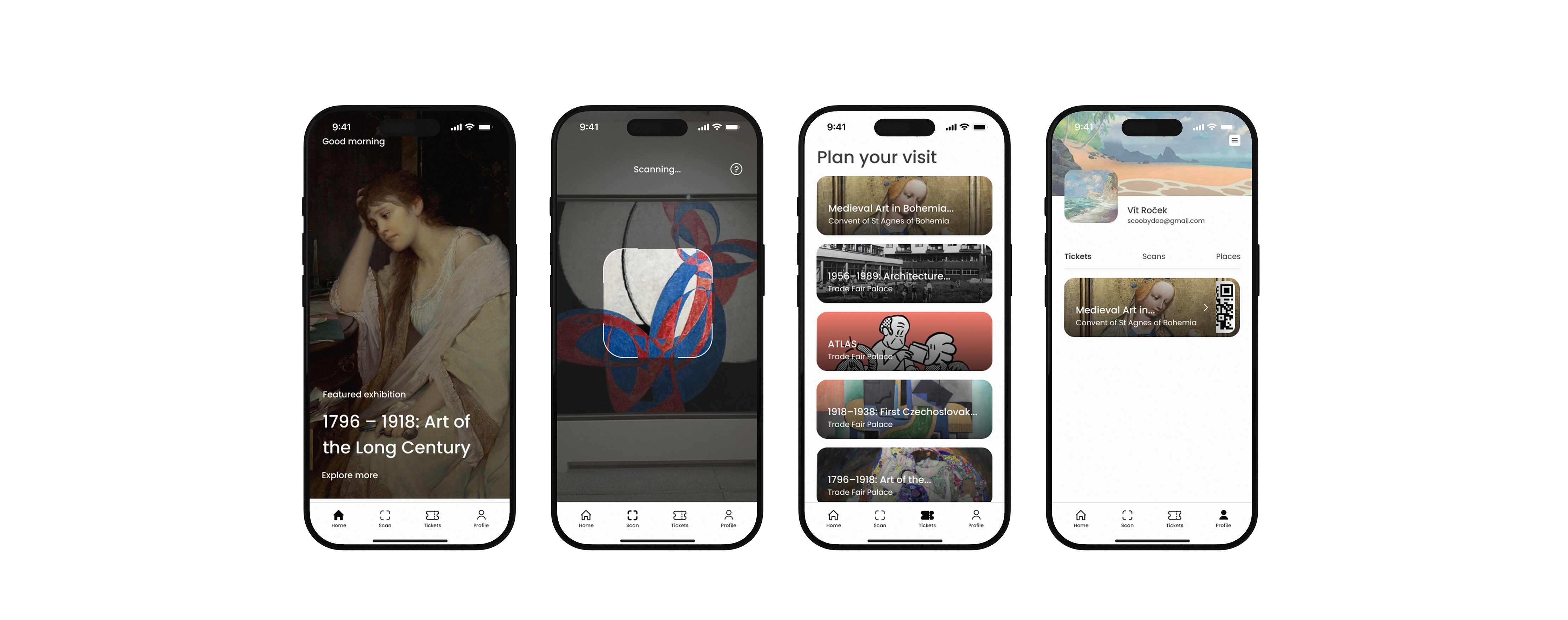
A mobile interface designed to connect physical exploration with digital interaction.
The final outcome wasn’t just a prototype, it was a vision of a better gallery experience.
Visitors could:
“The experience shifted from passive viewing to active exploration.”
The project was also shared with the National Gallery Prague as a forward-looking concept.
Designing for cultural spaces is a balancing act.
Too much information overwhelms. Too little disconnects.
Three key lessons shaped my approach:
Working solo across the entire process strengthened not just my skills—but my ability to make decisions with clarity and intent.